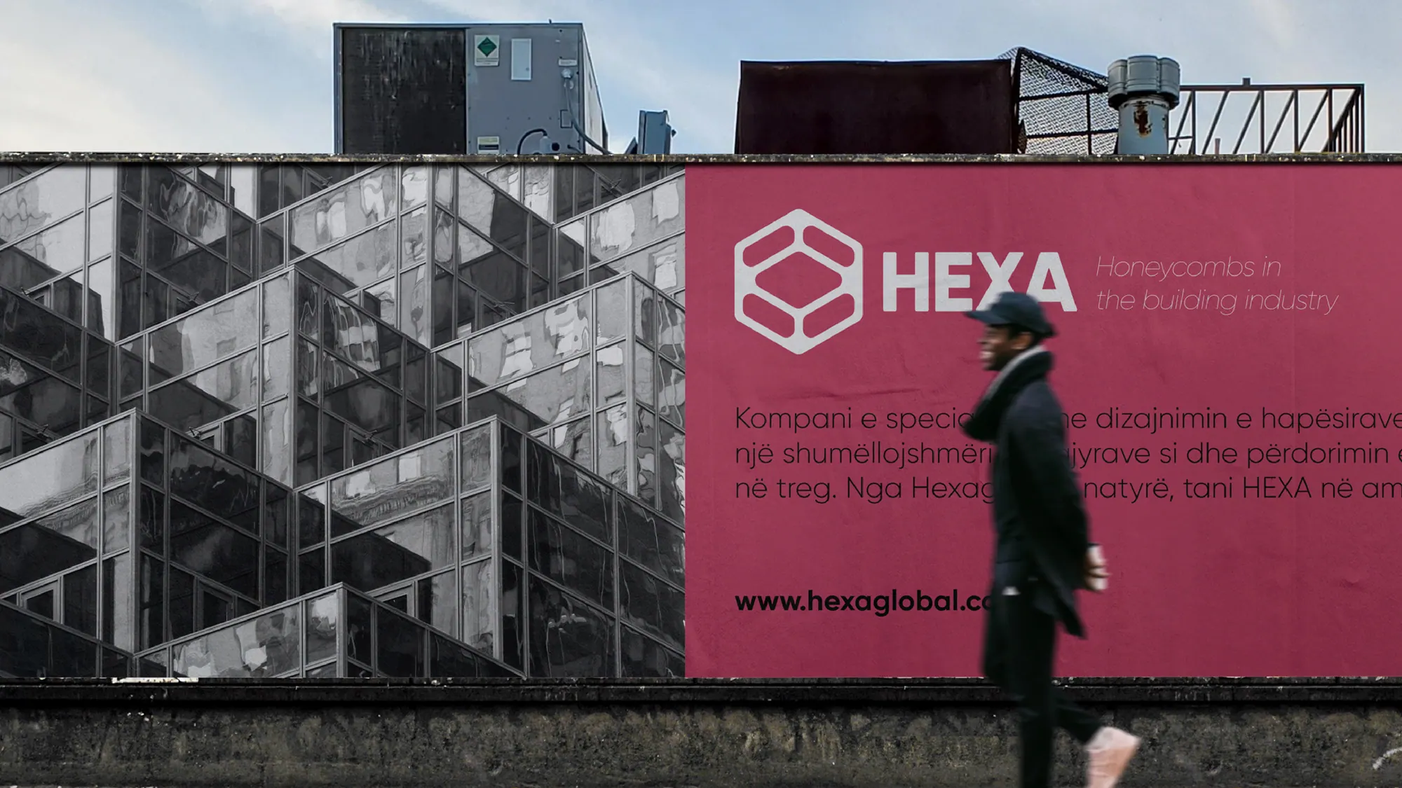
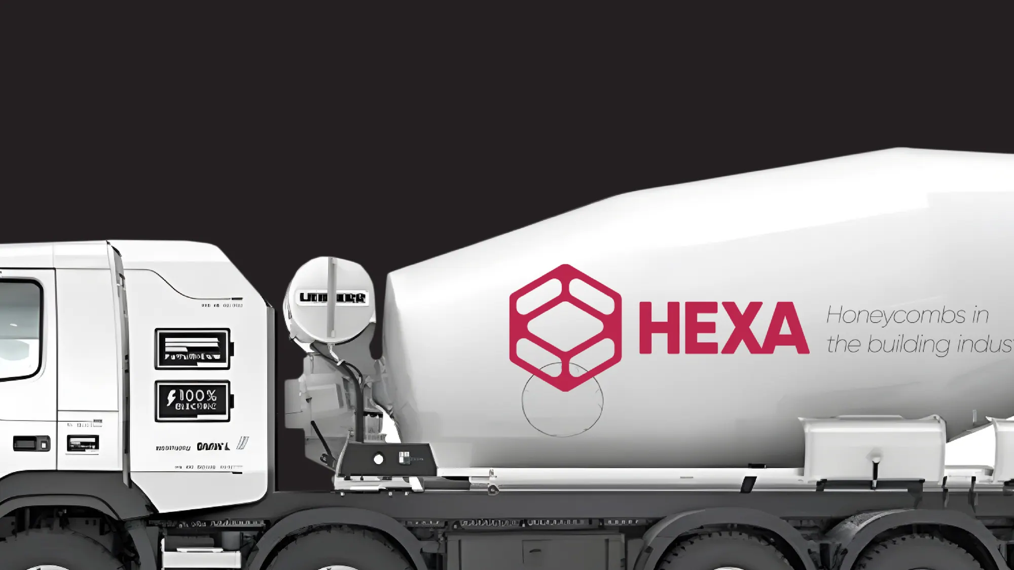
Brand identity for Hexa, a maker of steel skeletons for the building industry. One hexagon, nature's strongest structure, becomes a honeycomb system that runs from business card to concrete mixer.
The story
The challenge
Hexa engineers the steel skeletons that hold buildings up, precise, load-bearing work that disappears the moment the walls go on. The company had a reputation built on word of mouth but no identity to match the strength of what it made, and a name drawn from 'hexagon' that its old mark never paid off.
The approach
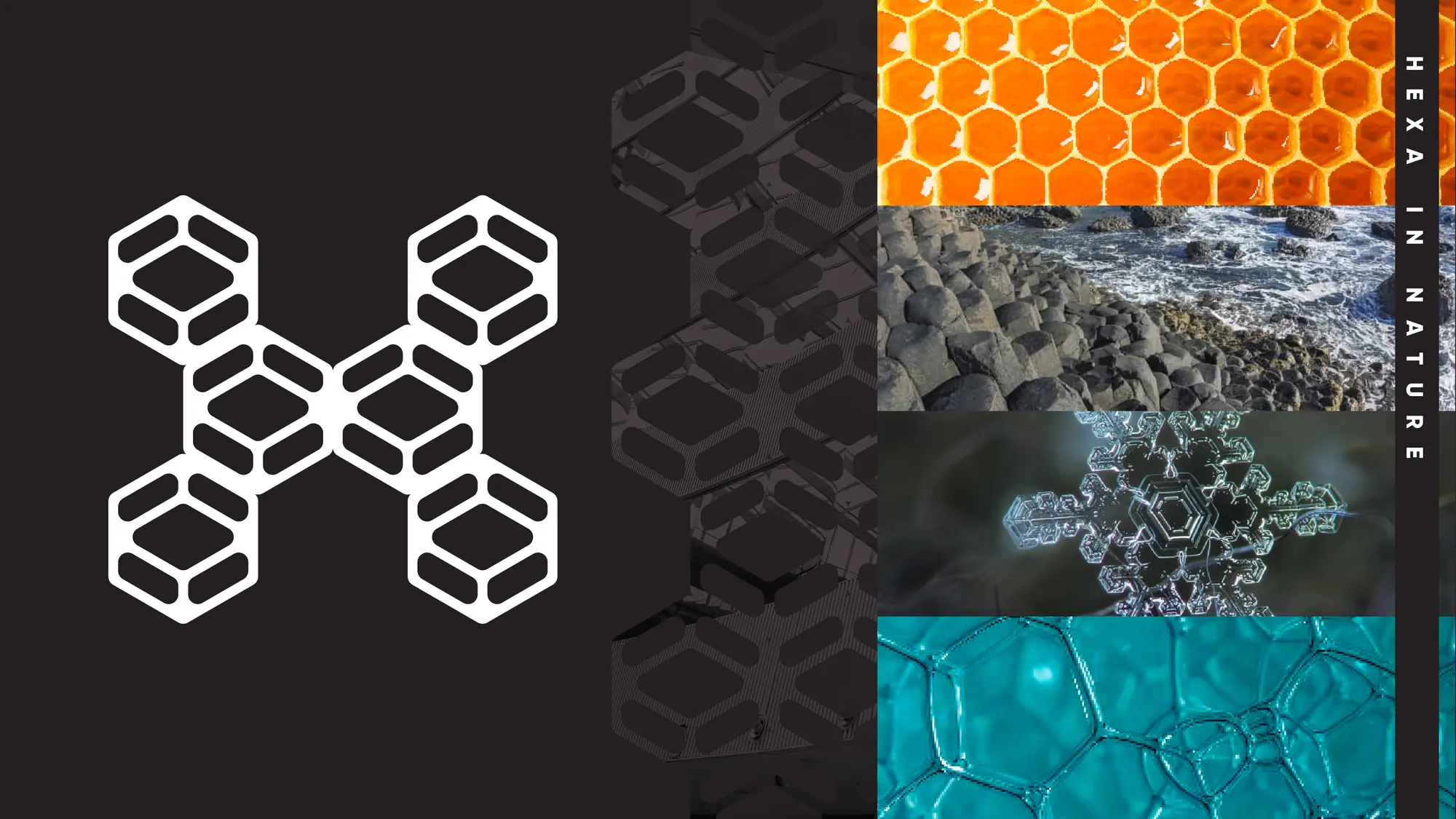
We went back to the source: the hexagon, nature's most efficient load-bearing shape, the reason honeycomb, basalt and bone are strong for their weight. The mark is a single hexagonal cell drawn as interlocking steel members, and it tiles into a honeycomb grid that frames everything from a business card to a concrete mixer. A deep crimson and a structural grotesque wordmark keep it industrial, not decorative.
The outcome
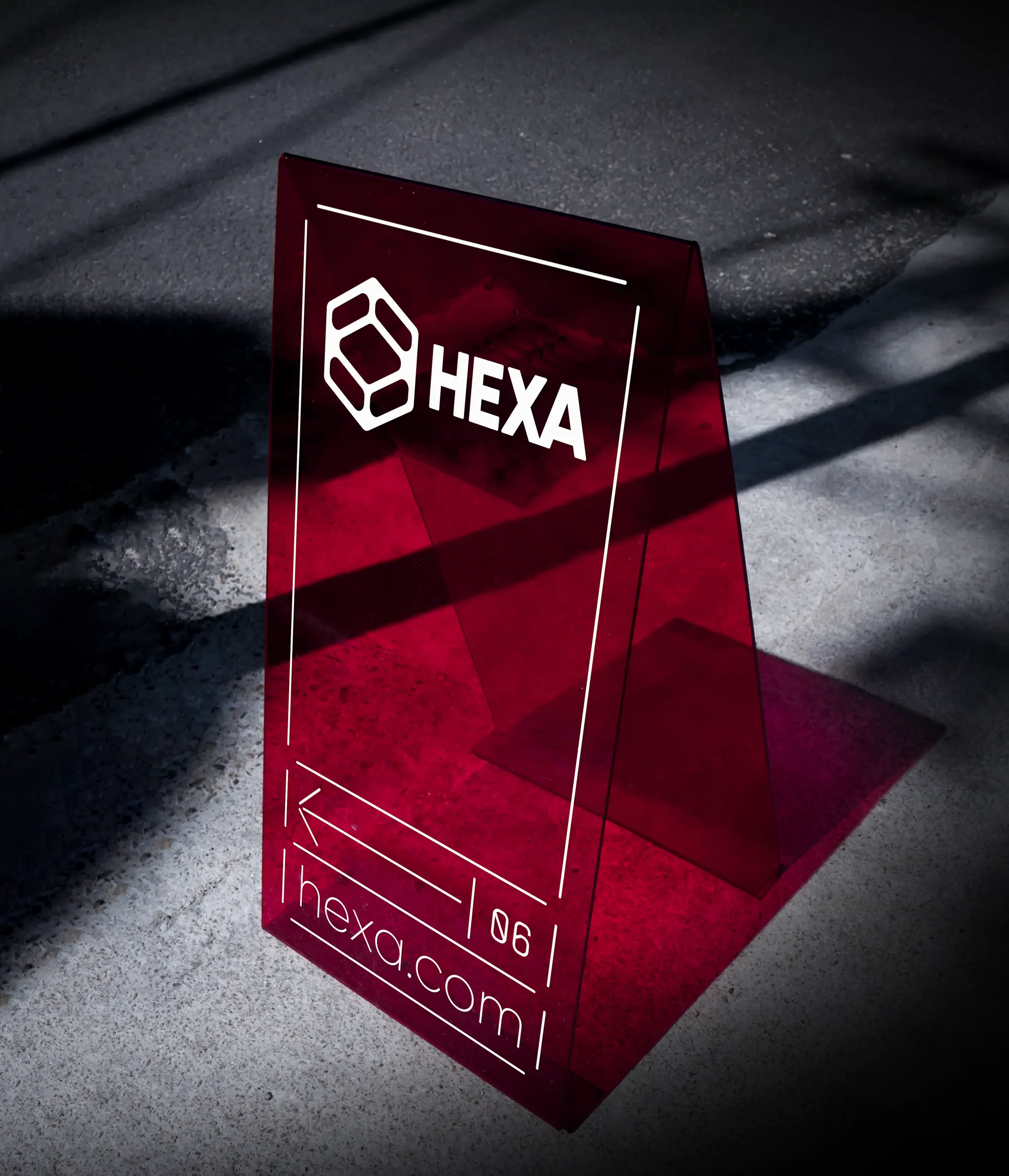
Hexa launched with a full identity: logomark, wordmark, stationery, vehicle livery, signage and a mobile app, all built on the same honeycomb grid. The system gives a technical, unglamorous business a confident face, and a kit the team can extend to any new product line without breaking the pattern.
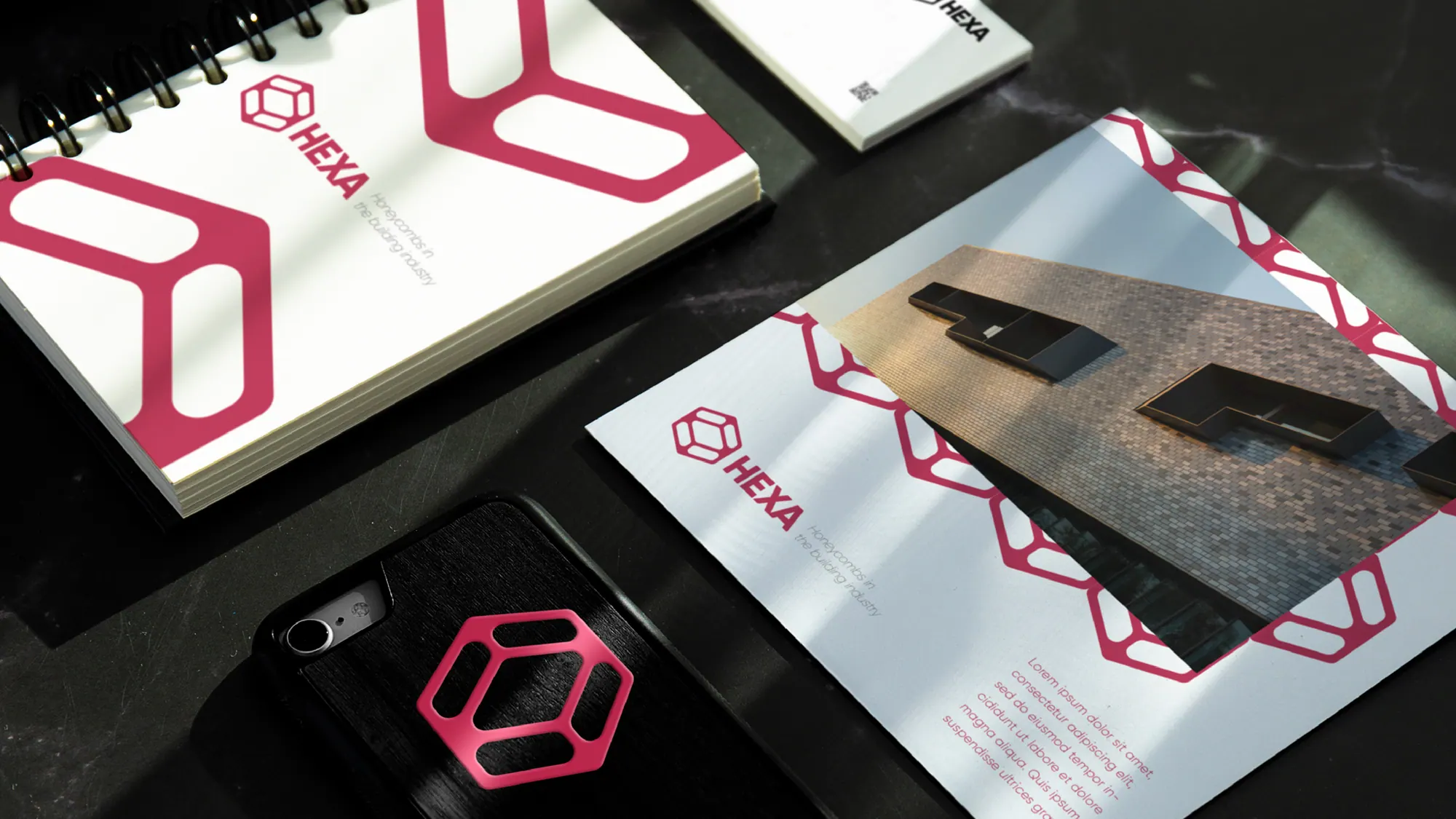
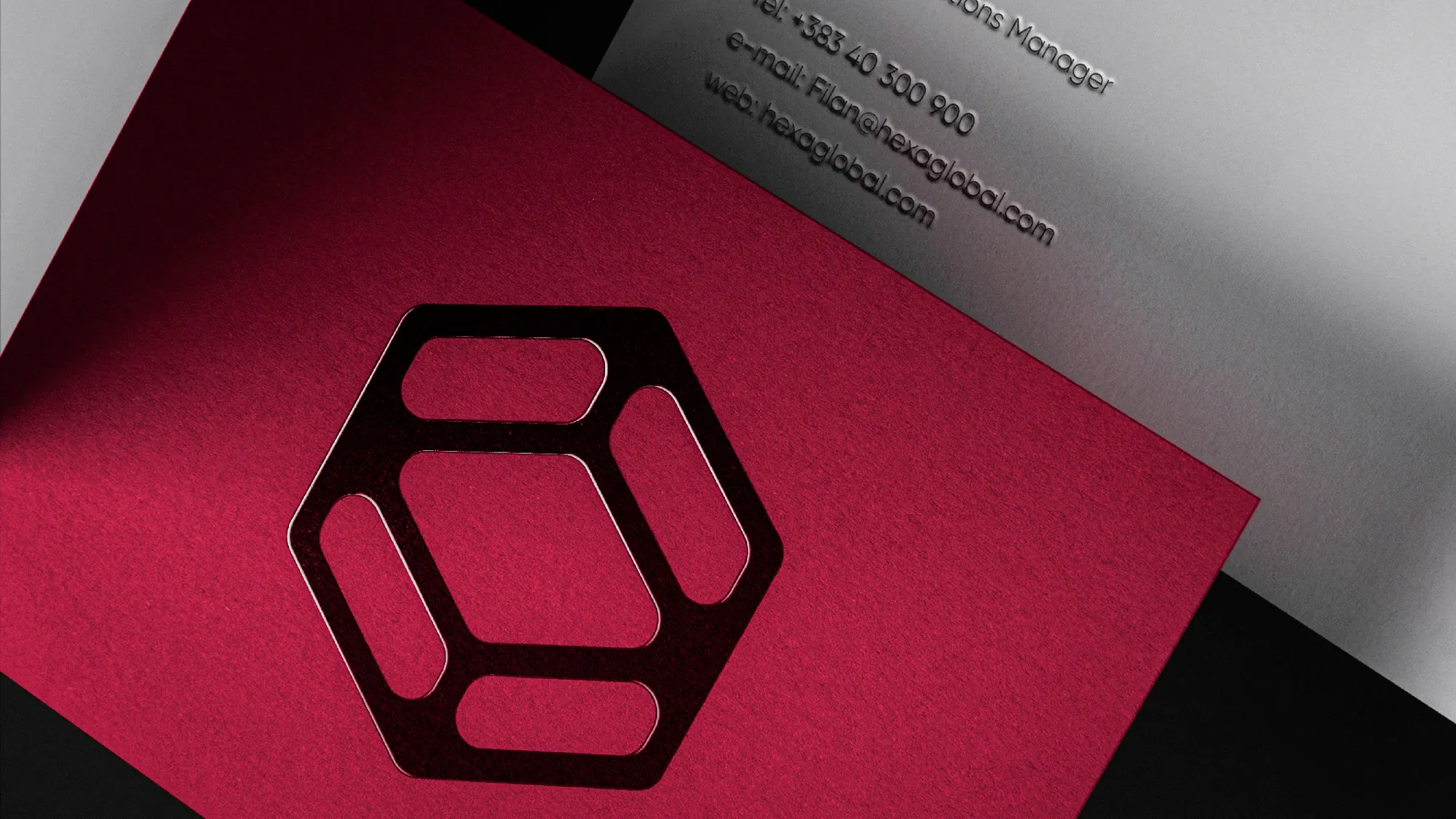

A structural engineer that finally looks as engineered as its work, one honeycomb system, applied end to end.