.webp)
Brand identity for an Adriatic charter and marine-services operator. A pennant flag carrying a north star above a set of waves runs from harbour signage to the crew's caps.
The story
The challenge
Nordriatic runs charters, docking and marine logistics across the Adriatic, but presented itself with a plain name and no consistent mark. The brief called for an identity that reads as trustworthy and genuinely seaworthy across everything from a harbour sign to a crew cap.
The approach
The mark is a pennant flag carrying a four-point north star above a band of waves, a signal you can read from the water and a quiet nod to navigation. A deep navy and a warm cream keep it nautical without novelty, paired with a classical serif wordmark, and a tiling wave pattern extends the system across the larger surfaces.
The outcome
The identity rolled out across signage, staff apparel, ID lanyards, drinkware, printed posters and the website, each piece built from the same flag, star and wave language, so a coffee cup on the dock reads as clearly Nordriatic as the sign above the office.
.webp)
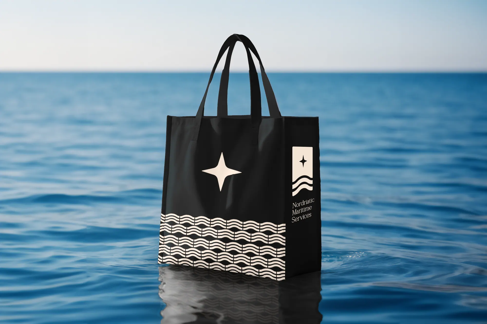
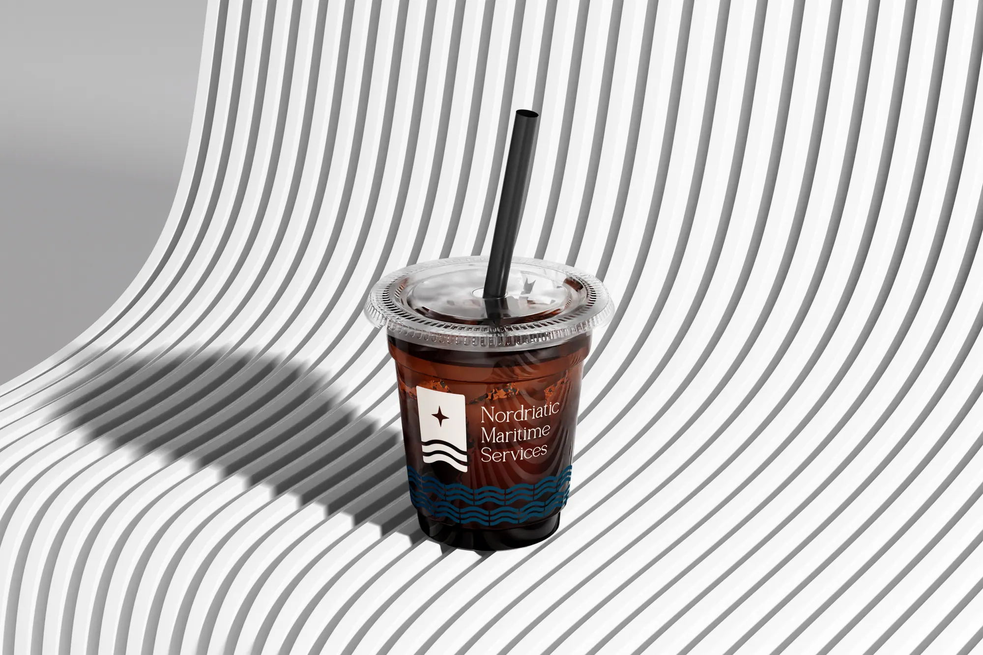
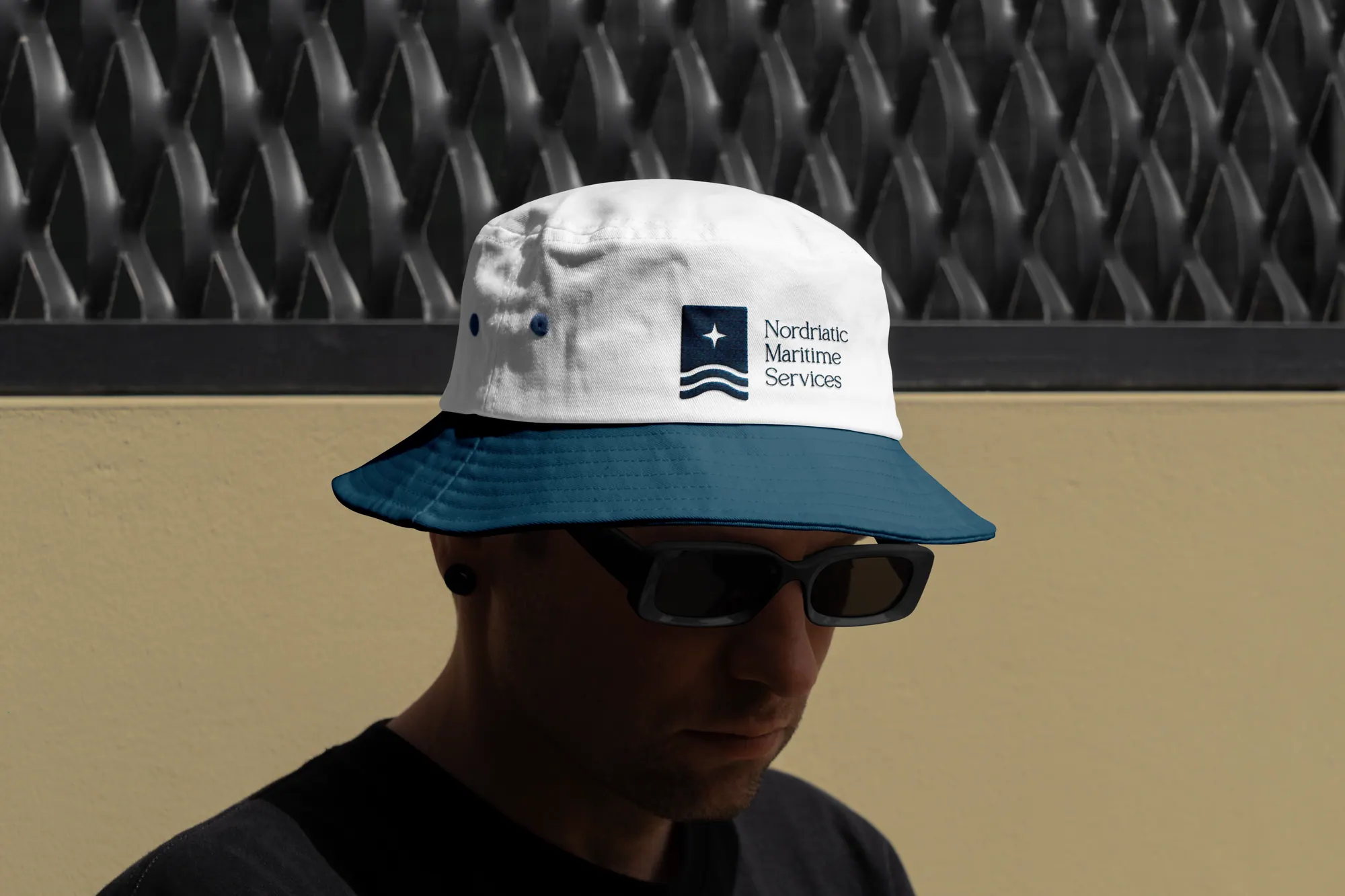
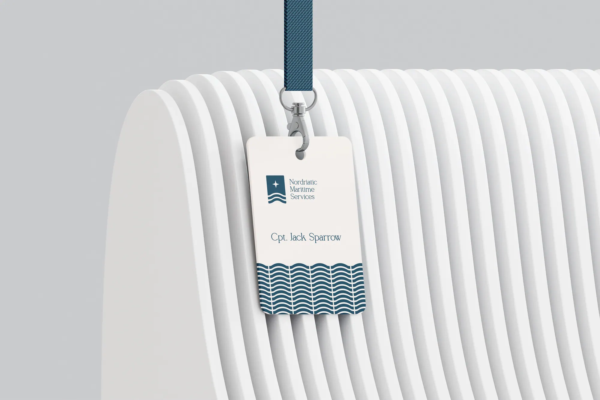
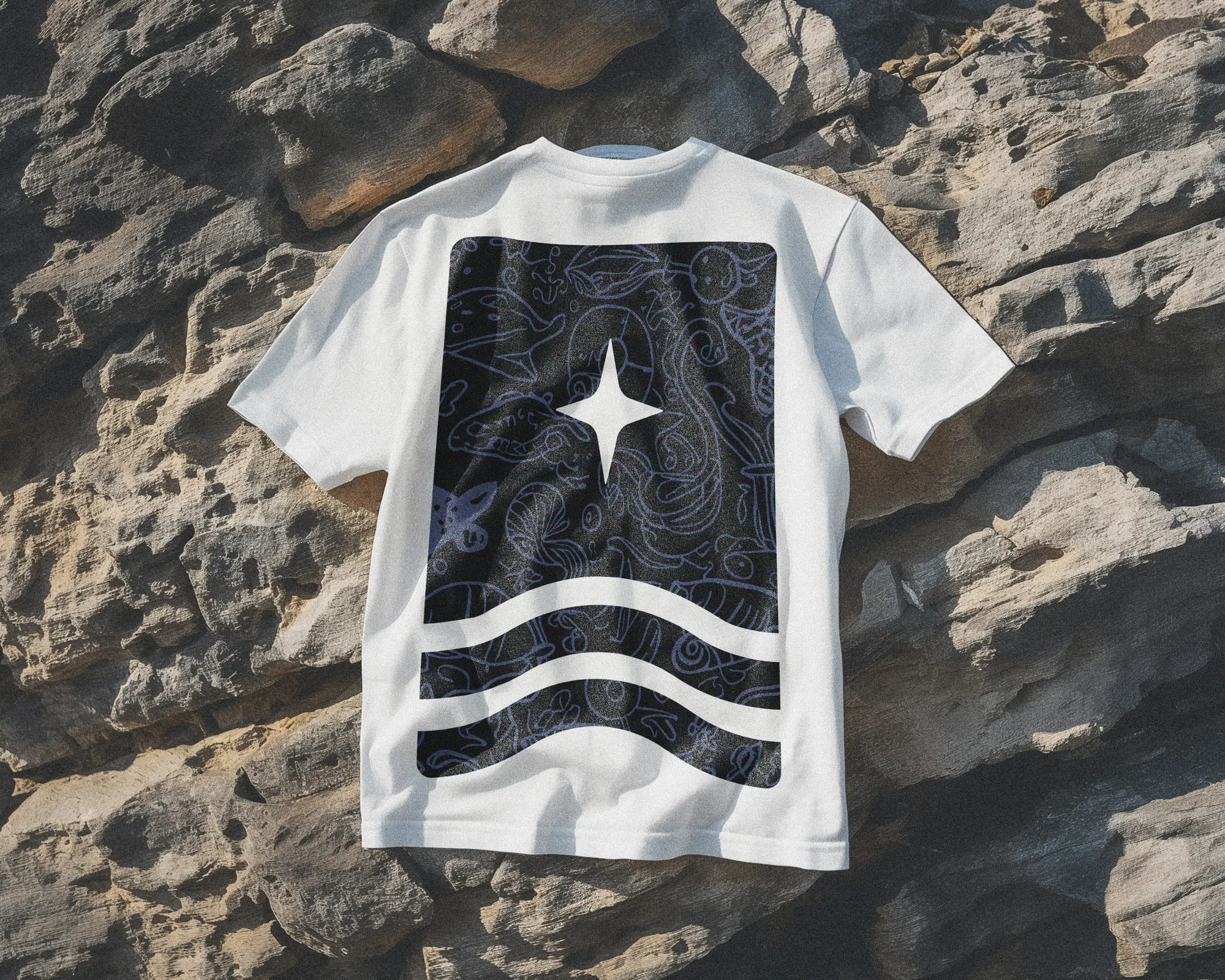
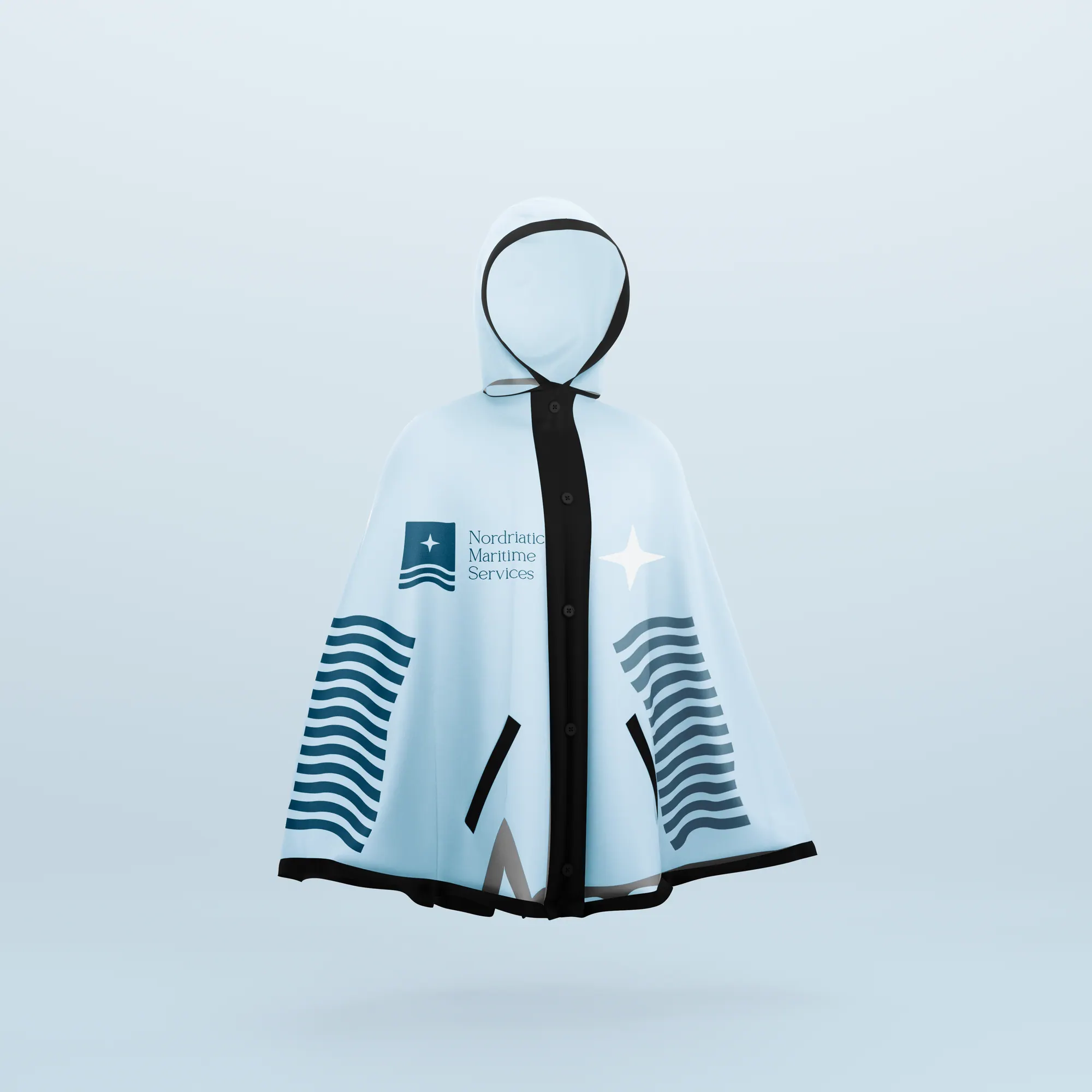
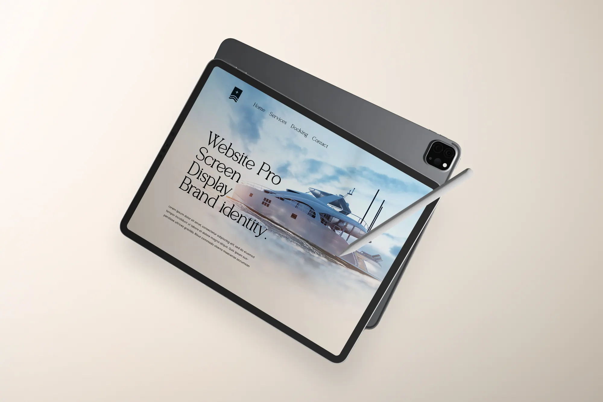
One flag, one star, one wave, a maritime brand that holds together from the harbour sign to the crew's caps.