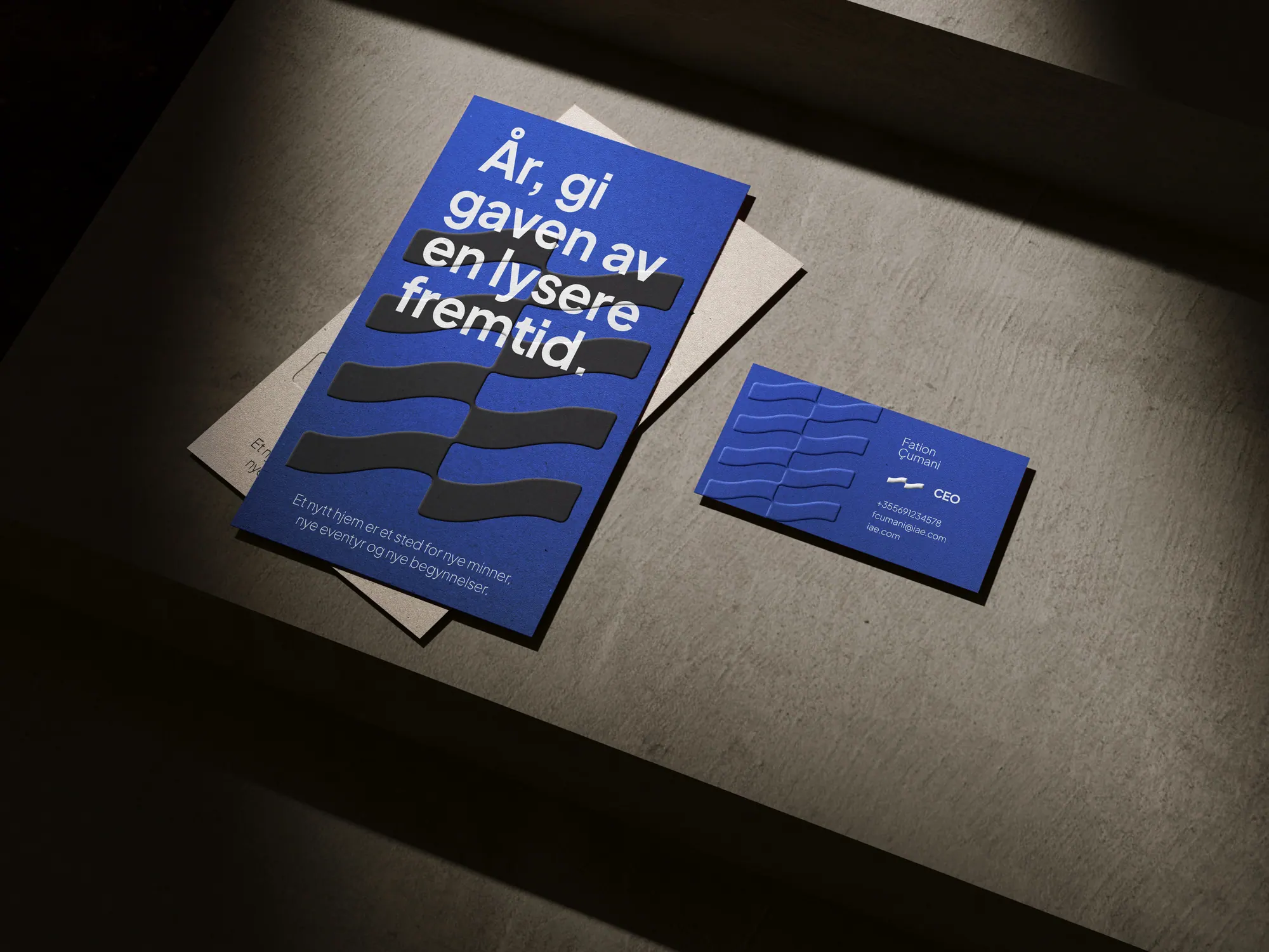
Brand identity for a real estate brand connecting Finnish homebuyers with the untouched Albanian Riviera. A stacked wave mark, Nordic typography and a palette of strong contrast and soft gradients speak to a calm, elevated life by the sea.
The story
The challenge
Ionian Adriatic Estate sells homes on the untouched Albanian Riviera to a Northern European audience, primarily Finnish buyers. The brand had to speak to a specific lifestyle, calm, elevated and deeply tied to nature, inviting people to picture new beginnings on the Mediterranean coast, where sunlight, sea and simplicity meet.
The approach
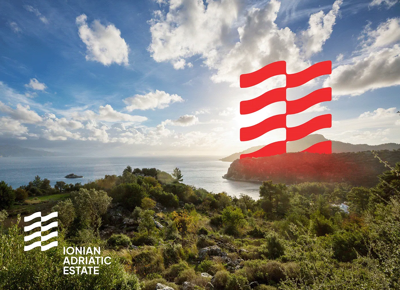
The logo takes its cue from waves: soft, flowing forms stacked in parallel to create a rhythm that reads as both movement and balance, while subtly echoing flags, horizons and coastal terrain. It's bold enough to work as a landmark and minimal enough to feel timeless. Around it, clean typography and spacious, Nordic layouts pair with a palette that blends strong contrast and soft gradients, fresh and premium without ever being loud.
The outcome
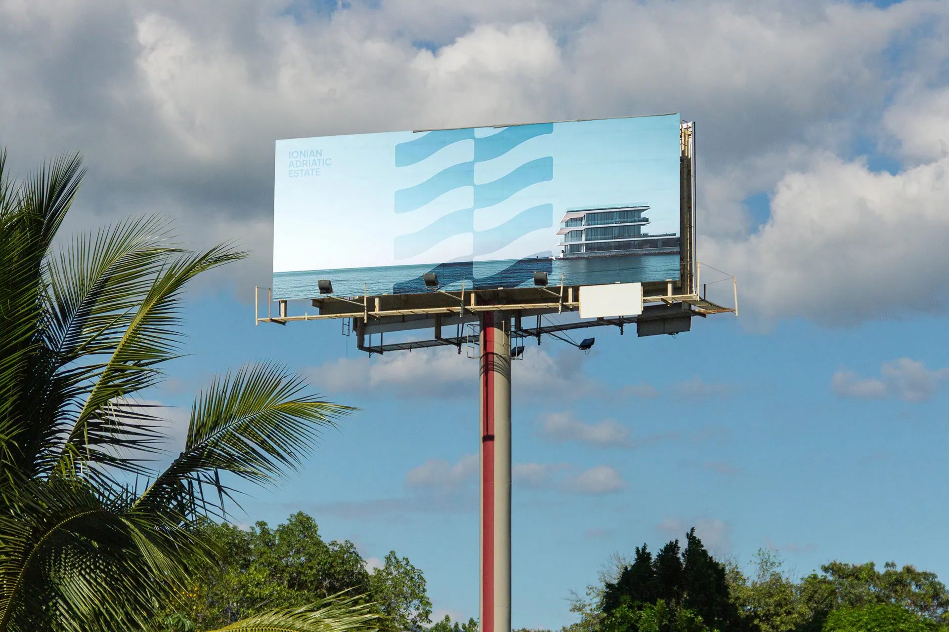
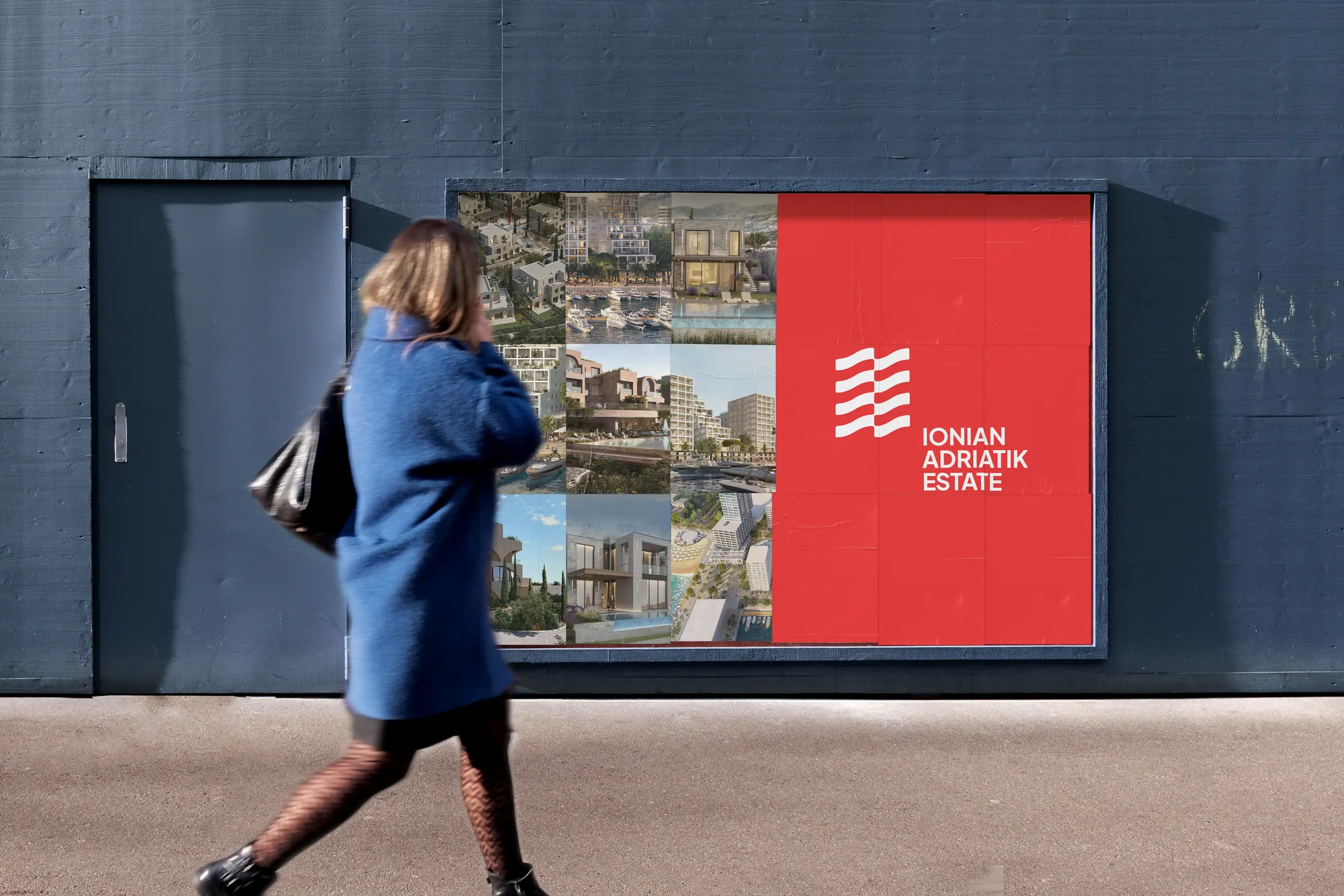
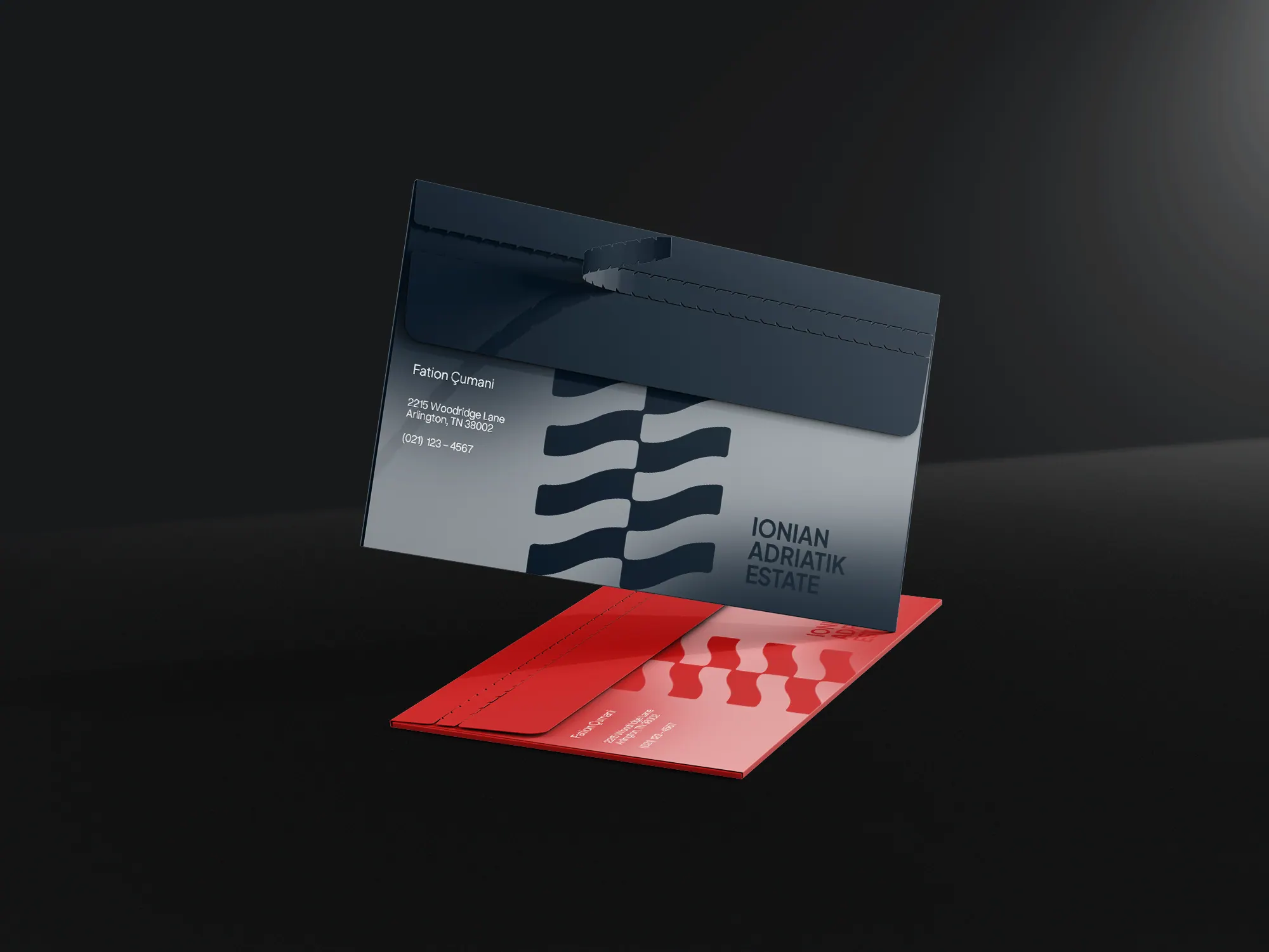
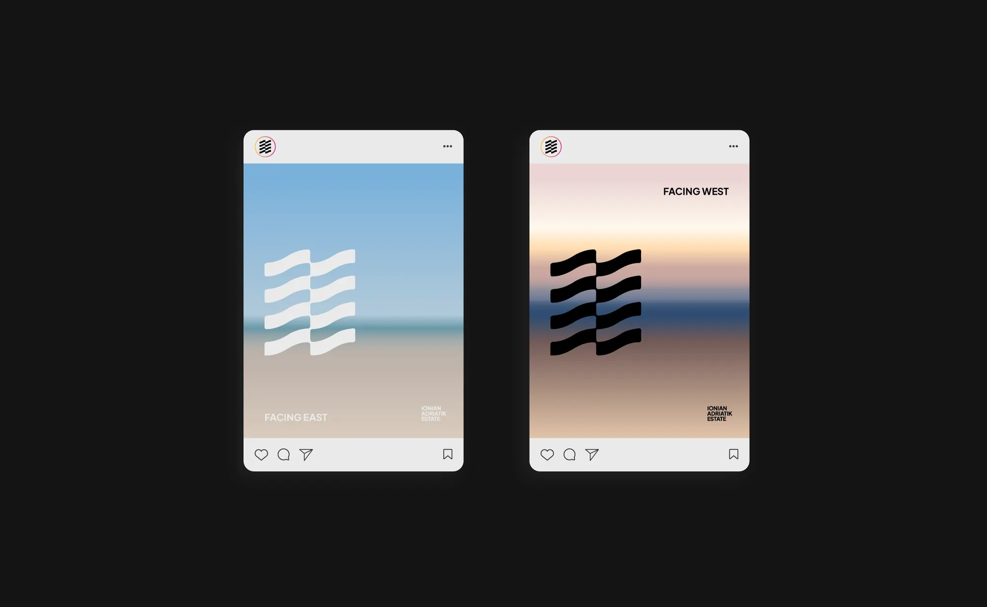
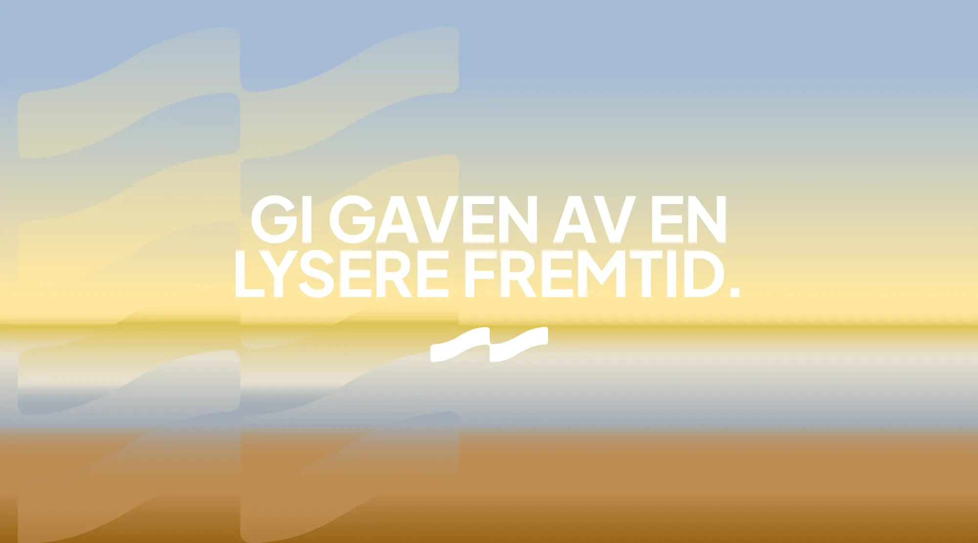
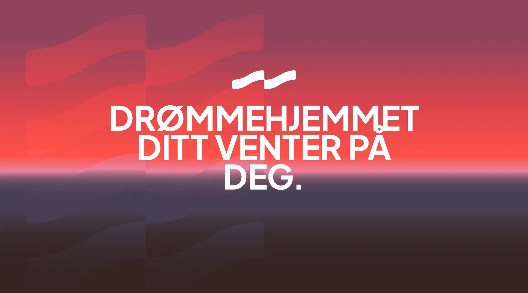
The system runs across stationery, out-of-home, an app icon, a social template set, collectible stamps and motion, each touchpoint communicating trust, clarity and a deep respect for place, from a business card to a coastal billboard.
.webp)

A place-rooted identity that turns a stretch of coast into a brand, one wave mark, carried with Nordic calm from stamp to billboard.