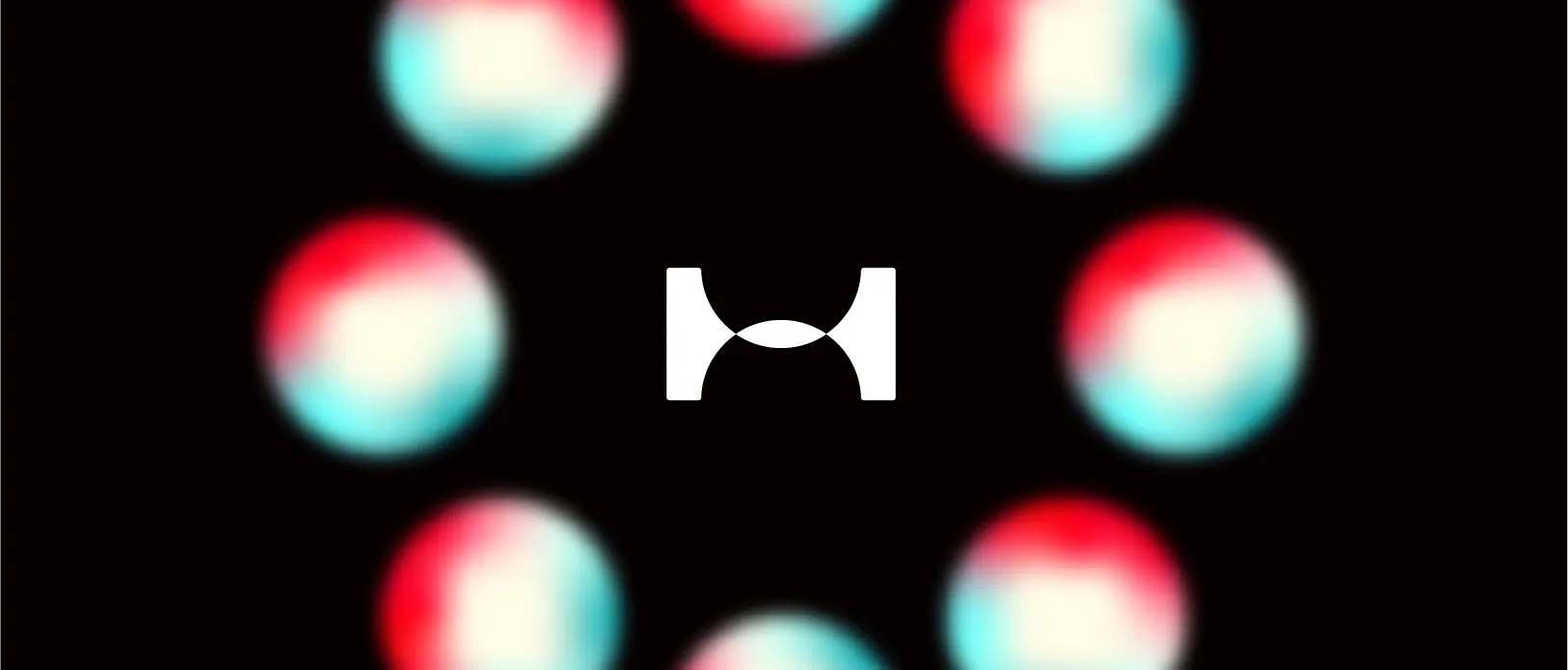
Brand identity for a space-science platform, a flexible lens mark and a cyan-to-magenta spectrum that runs from inbox to billboard.
The story
The challenge
Space content online splits in two: dense academic writing, or noise that trades accuracy for clicks. Horizon needed an identity that reads as genuinely scientific and credible, yet magnetic enough to stop a scroll and turn idle curiosity into a daily habit.
The approach
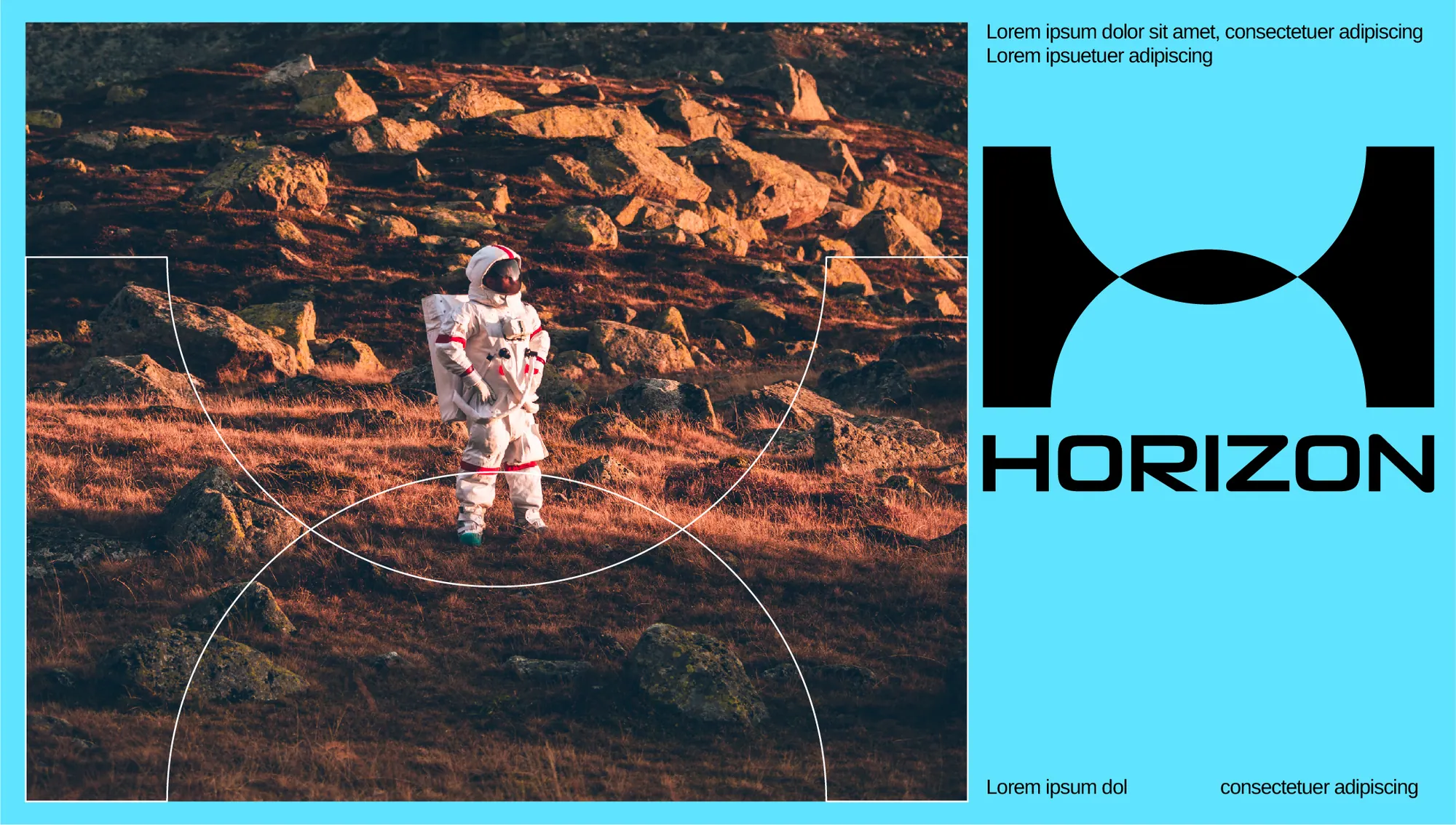
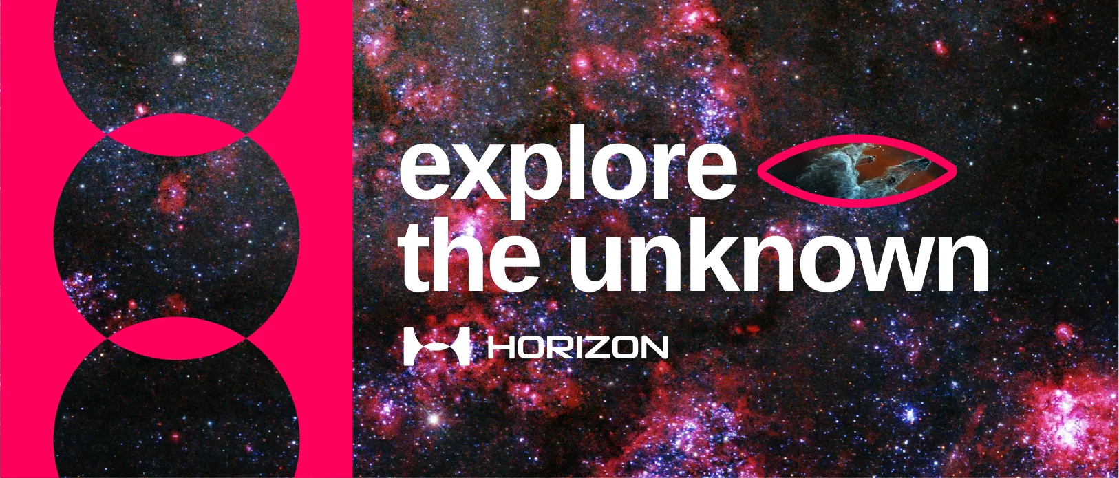
The mark is built from two intersecting circles, a body rising to meet its horizon, resolving into an 'H' lens. That single idea flexes everywhere: a frame around imagery, an aperture for headlines, a motion device for launch moments. A cyan-to-magenta spectrum keeps it alive against deep-space black, anchored by a wide geometric wordmark.
The outcome
Horizon launched with a full system: logo, editorial layouts, social templates, print and outdoor. The lens motif hands the in-house team an endlessly reusable container, so every new drop stays unmistakably Horizon without a designer in the loop.



A signature look in a crowded feed, and a flexible kit the team now ships with every week.