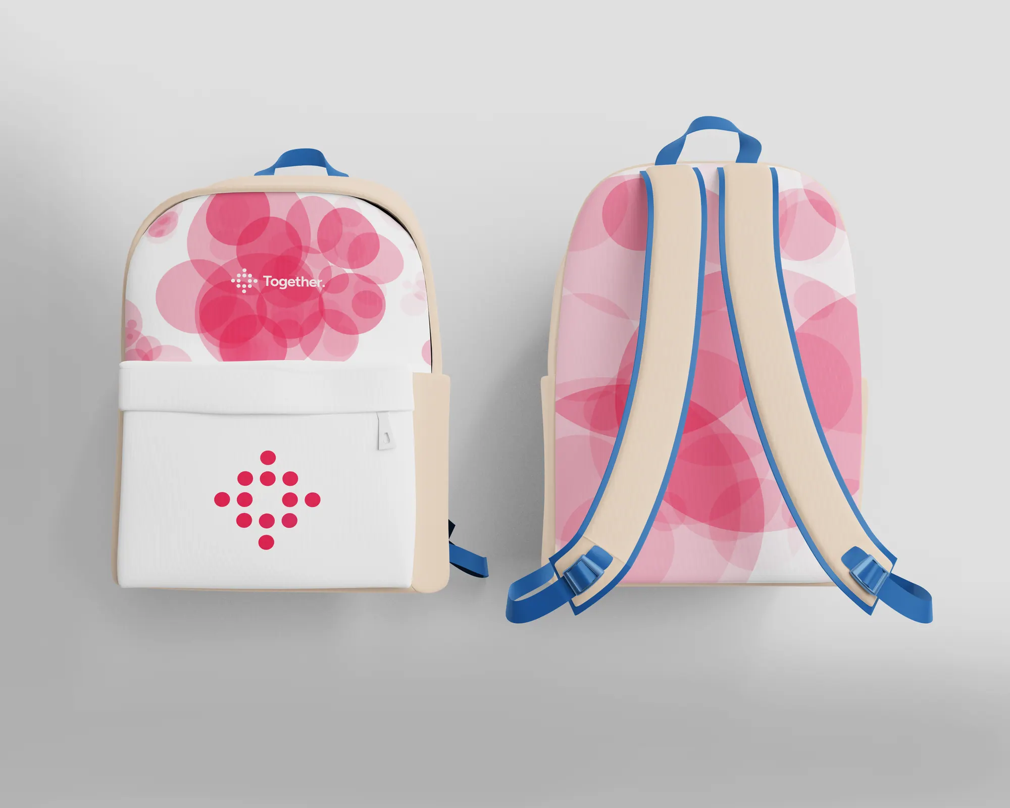
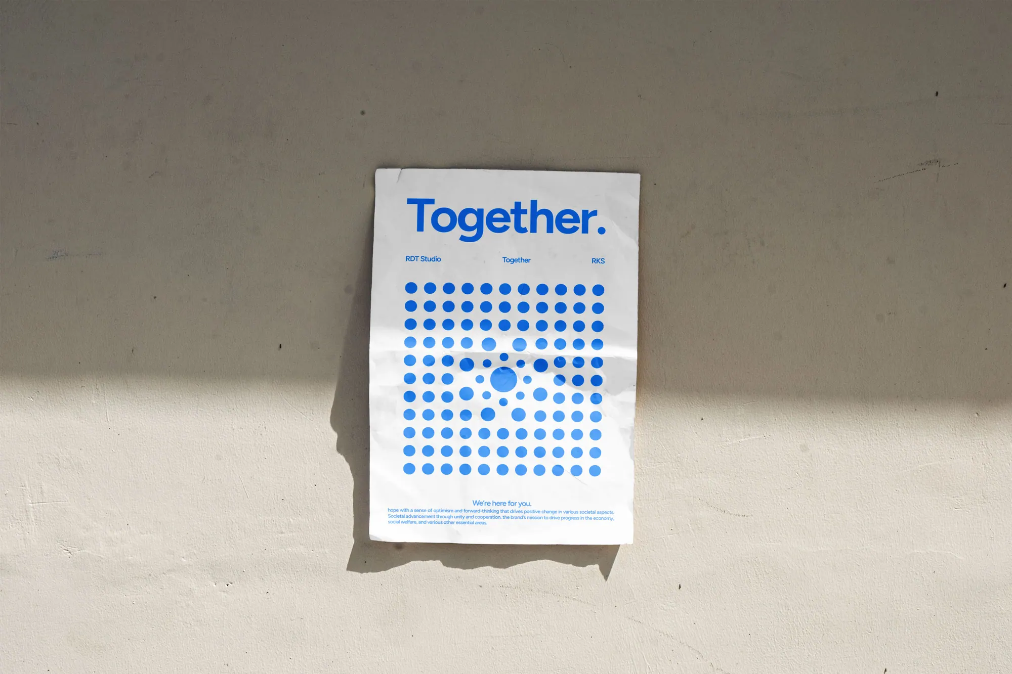
Rebrand for Together, an NGO driving social change. A cluster of dots, built on repetition and unity, stands for societal advancement through cooperation, carried across a bold, optimistic palette.
The story
The challenge
Together is an NGO working to drive social change across the economy, social welfare and other essential areas. Its old identity didn't carry the sense of unity and momentum behind the mission. It needed a system that could feel hopeful and human across everything from a poster to a backpack.
The approach
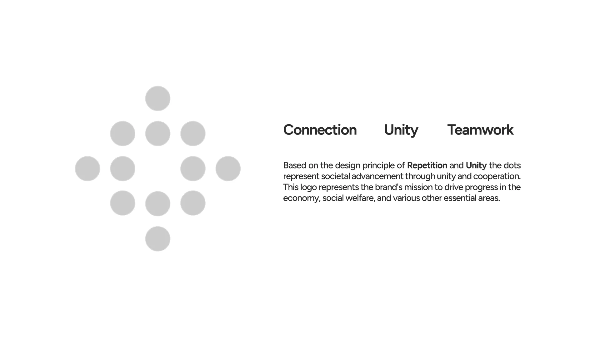
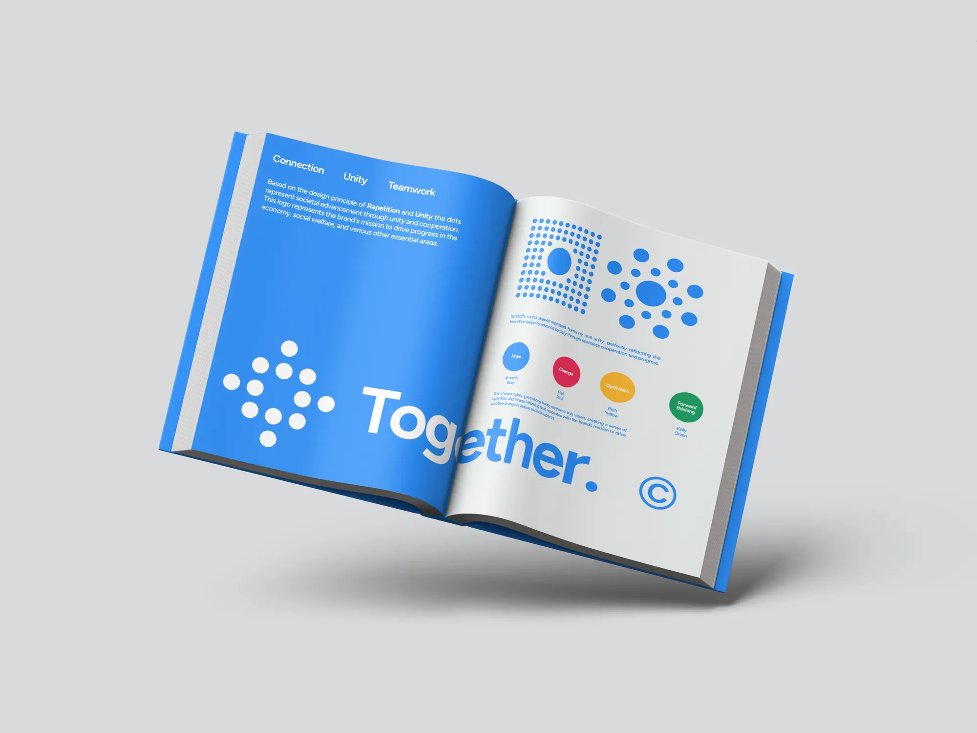
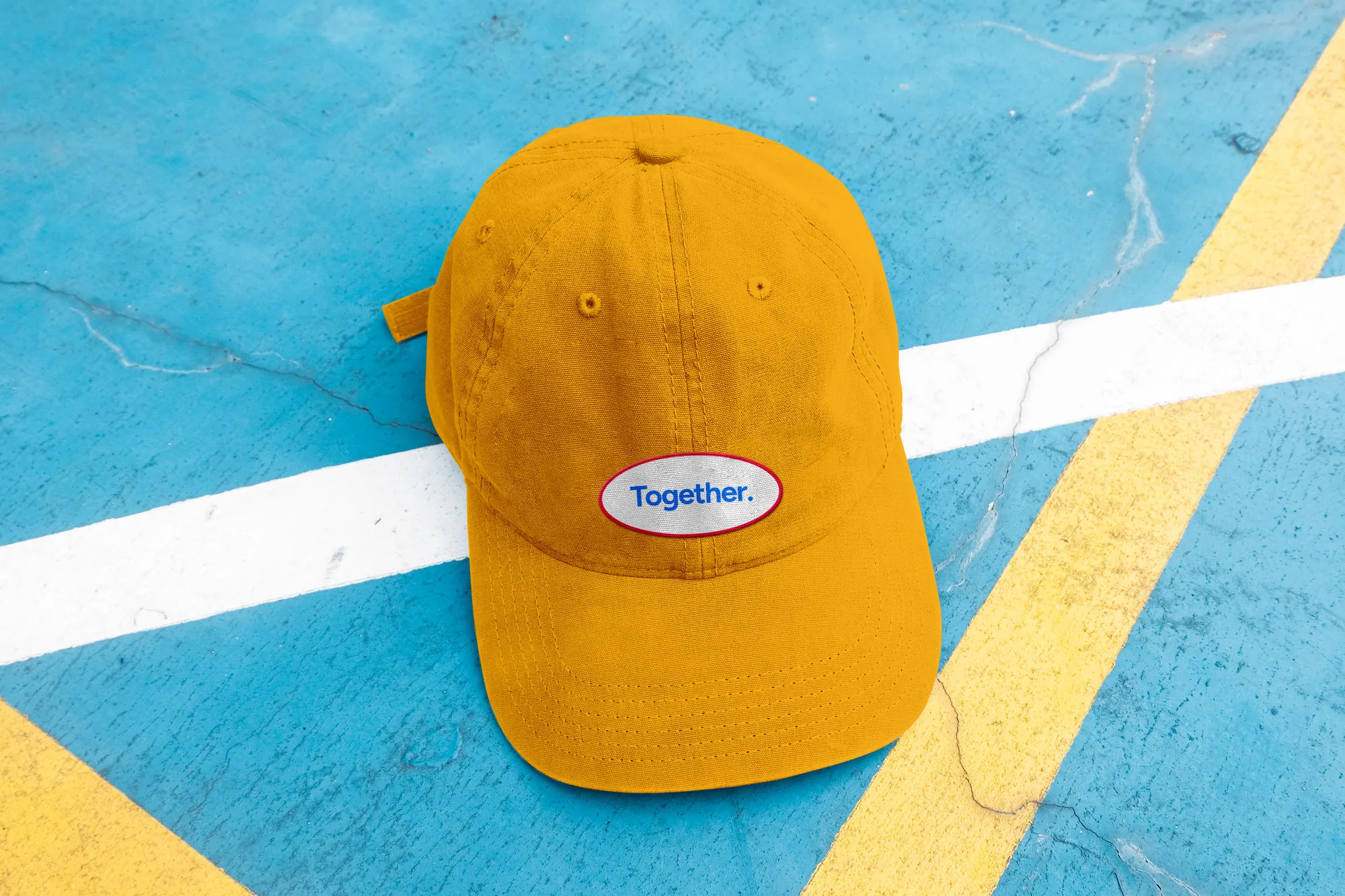
The rebrand is built on repetition and unity: a cluster of dots arranged into a single mark, where many small parts read as one whole, societal advancement through cooperation. A confident geometric wordmark sits beside it, and a four-colour palette, Smooth Blue for hope, Hot Pink for change, Rich Yellow for optimism and Kelly Green for forward thinking, keeps every application bright and optimistic.
The outcome
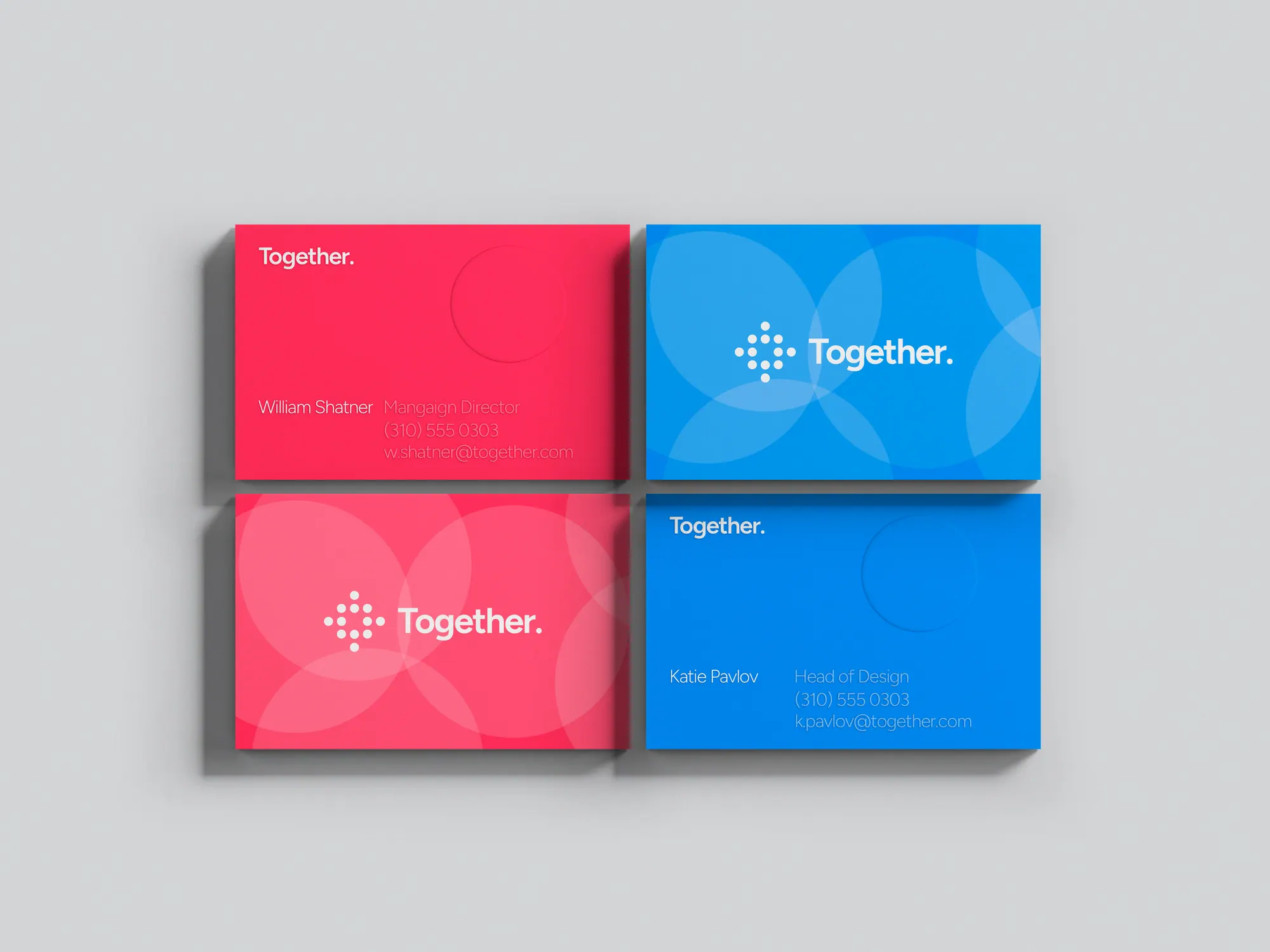
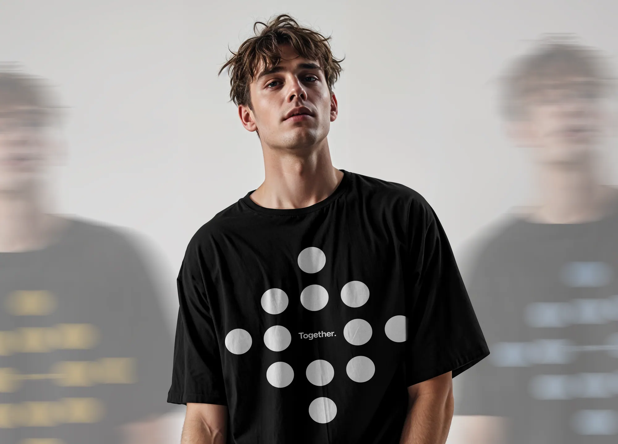
The identity rolled out across stationery, apparel, posters, merchandise and a full brand book, each piece built from the same dot system and palette, so the brand reads as unmistakably Together whether it's a business card or a backpack.
A rebrand that turns a mission into a mark, many dots, one movement, carried across every touchpoint.