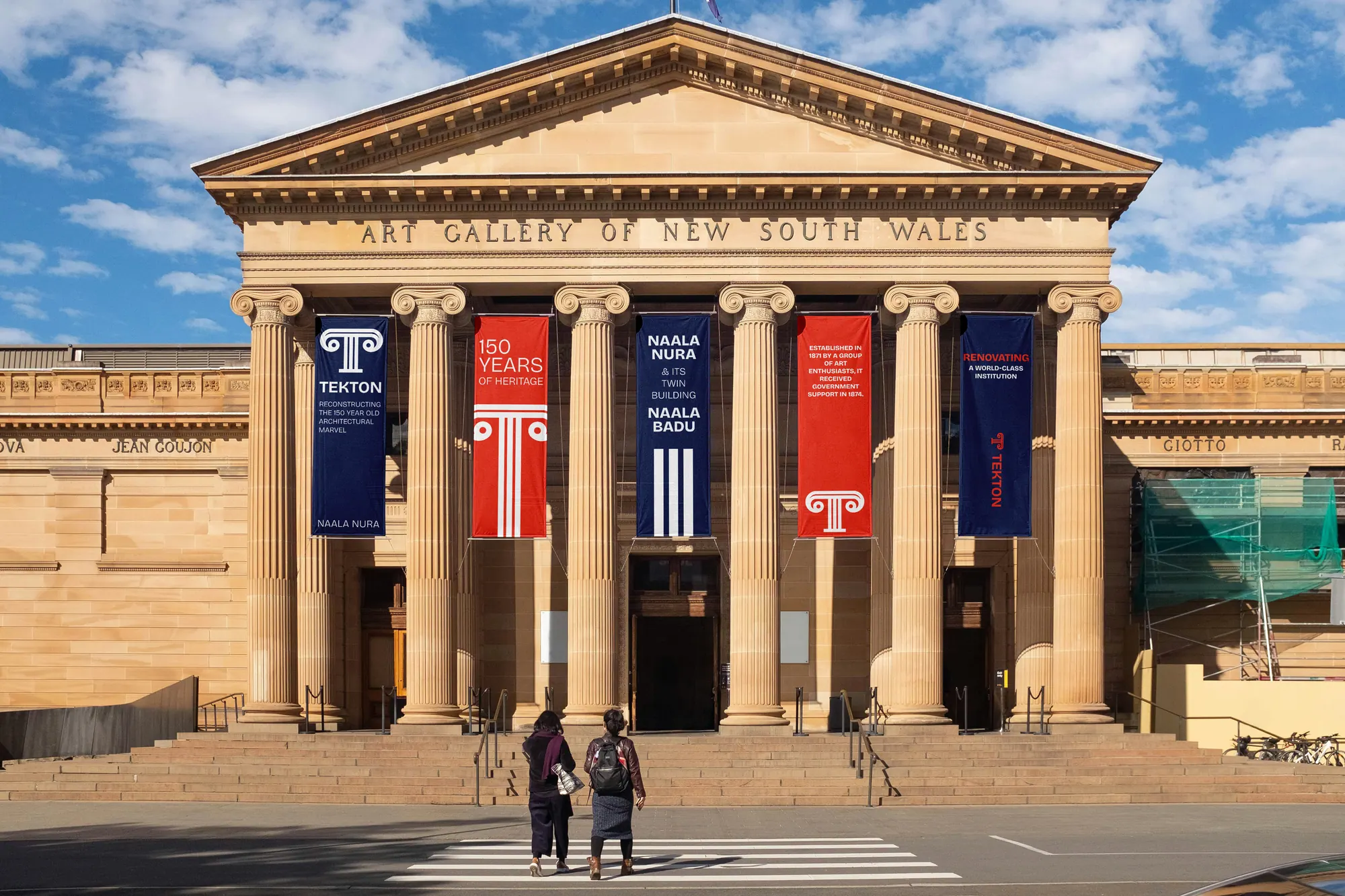
Rebrand for Tekton, a firm that rebuilds old architectural landmarks to their original glory. An Ionic-column monogram, a heritage red-and-blue palette and confident wayfinding carry the brand from facade banners to merch and web.
The story
The challenge
Tekton restores 150-year-old landmarks, galleries, churches and civic buildings, but its old identity read like a generic contractor. The rebrand had to signal deep respect for classical heritage while feeling like a modern, credible firm trusted to touch world-class institutions.
The approach
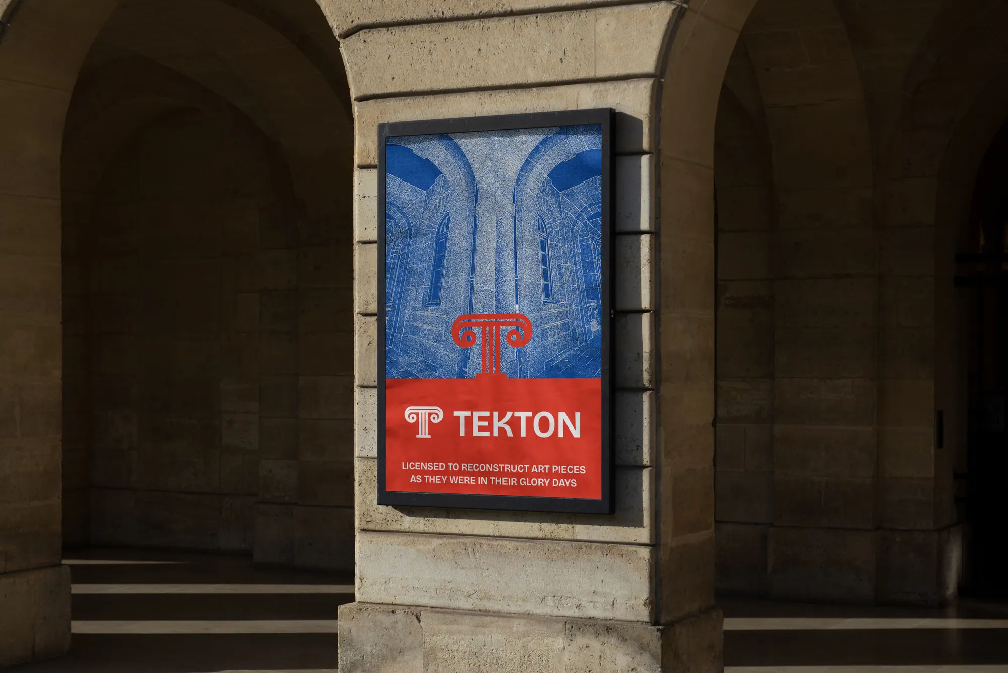
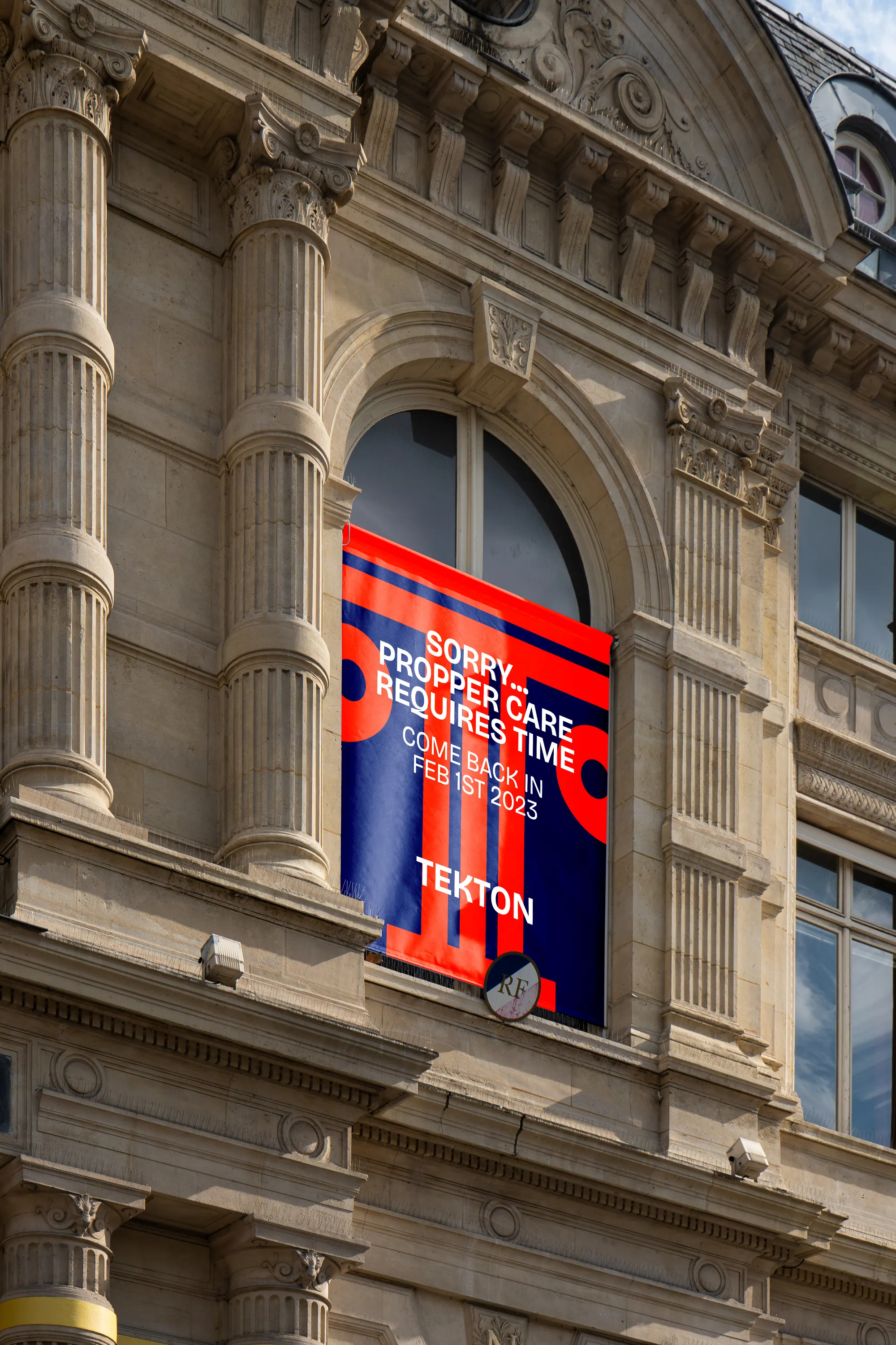
The mark rebuilds the letter 'T' as an Ionic column capital, the oldest structural language, redrawn cleanly. A confident red-and-blue palette pairs heritage warmth with institutional trust, and a tall geometric wordmark scales from a hanging street banner to an embroidered cap. Copy leans wry and self-assured: 'proper care requires time', 'as if W. W. Boyington redid it himself'.
The outcome
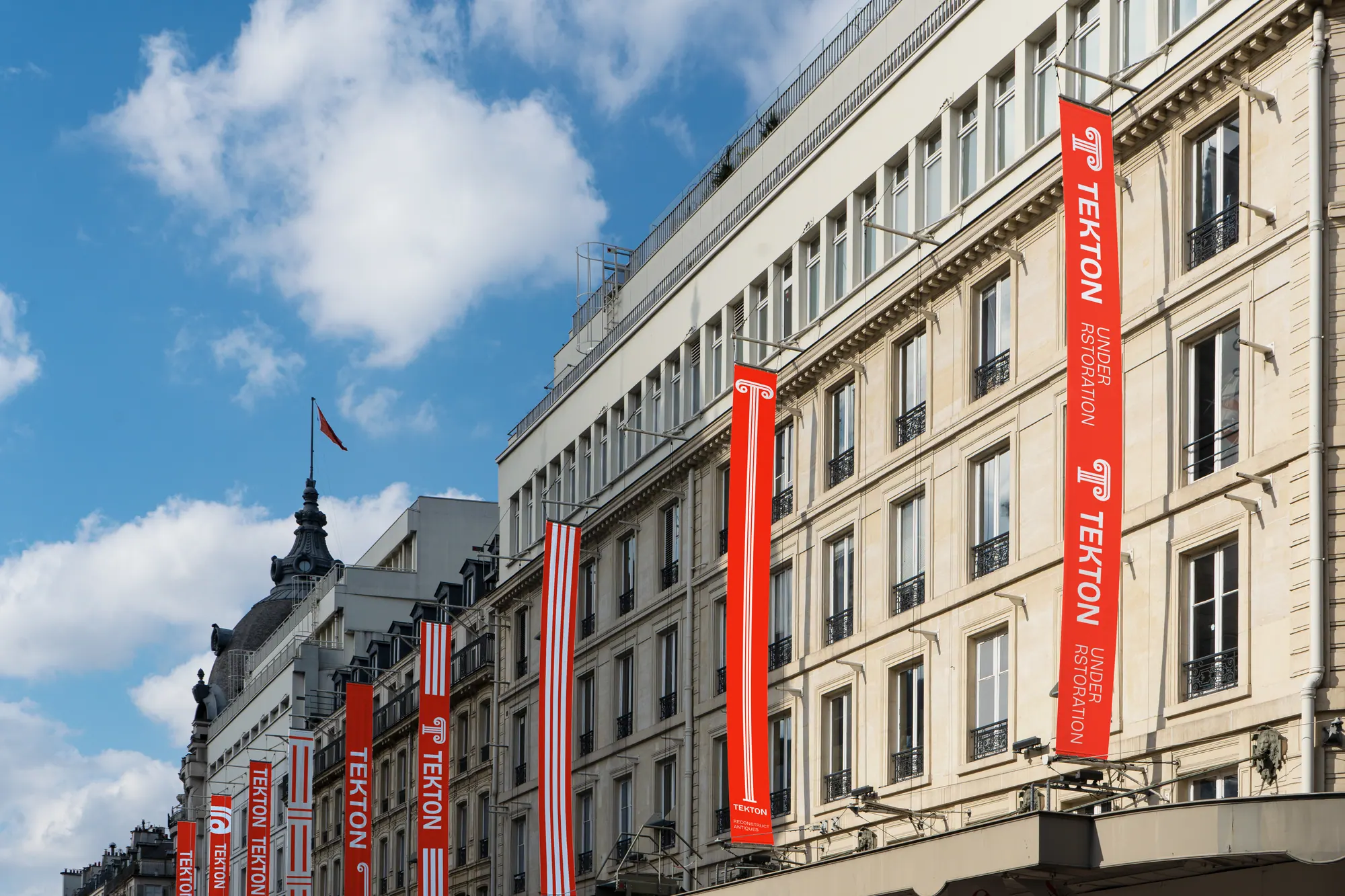
The system spans on-site scaffolding banners, institutional signage, out-of-home posters, merch and a curated-projects website, a kit that dresses a building under restoration as an event, not an inconvenience, and positions Tekton alongside the landmarks it rebuilds.
.webp)
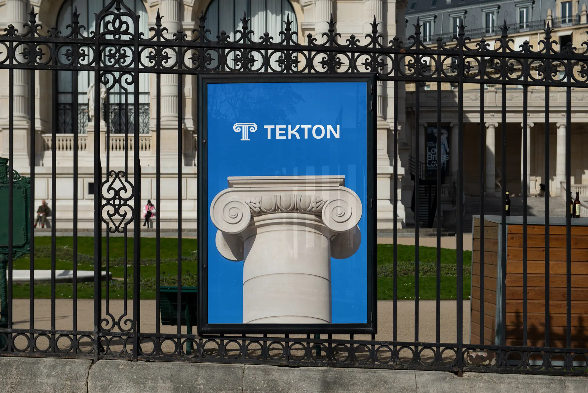
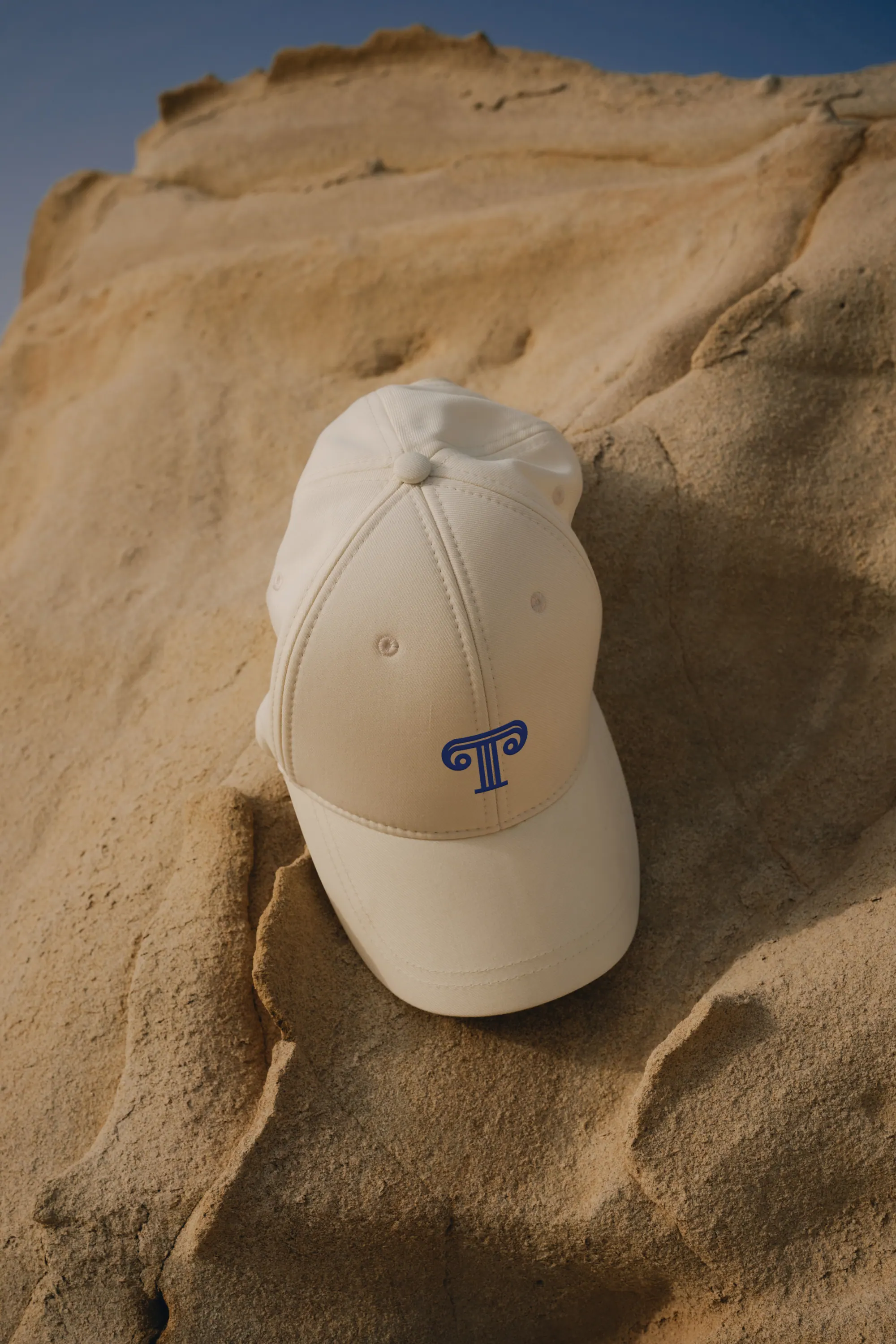
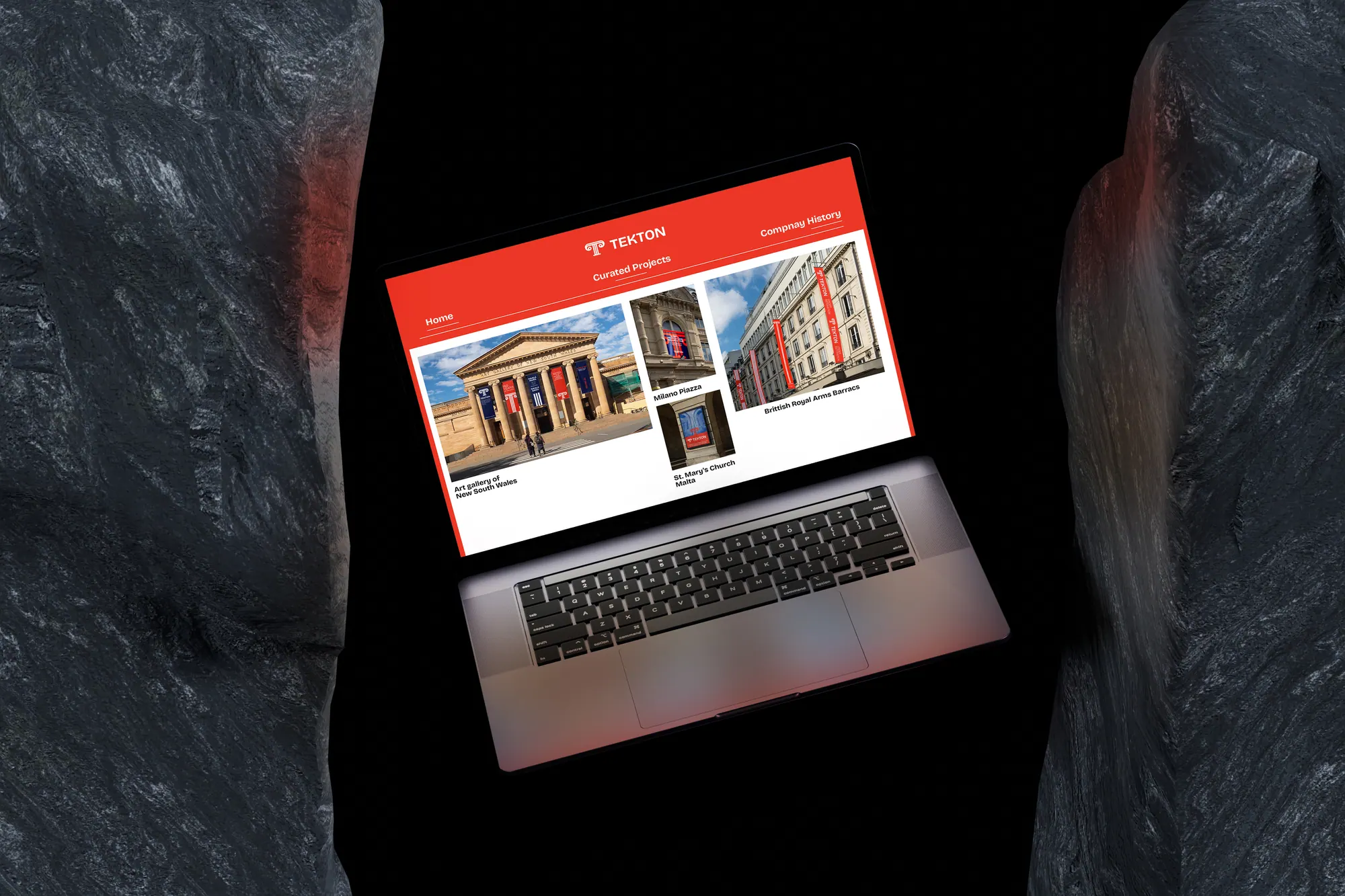
Heritage rebuilt as a brand, one column mark carrying Tekton from scaffolding banner to gallery facade.